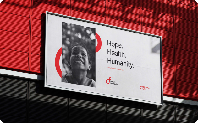
Healthier Futures,
For Life.
For Life wants everyone, regardless of where they live or what they earn, to have access to the healthcare, nutrition, and clean water that makes life worth living. Through programs rooted in communities — from maternal care to clean water systems, from nutrition support to emergency relief — For Life doesn't just respond to need. It builds toward a future where that need no longer exists. For life.
Considering that access, dignity, and genuine community transformation are at the heart of everything For Life does, the main design questions were: how do we visually translate a mission this enduring into an identity that truly carries it? How do we build something that communicates — to a struggling mother, a rural community, a global partner — that this support is not temporary? That it is for life?
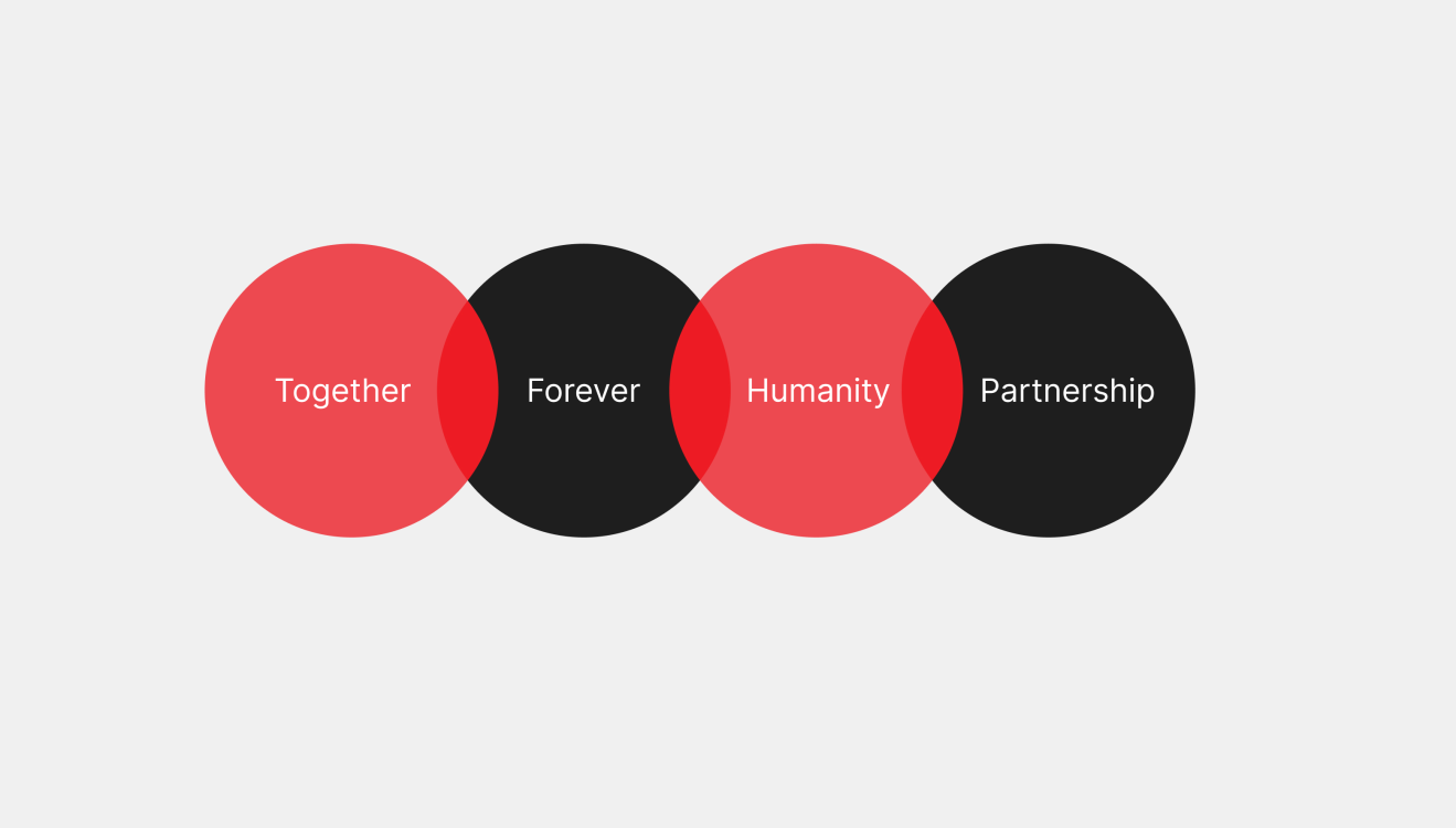
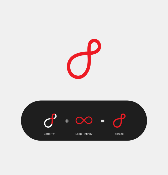
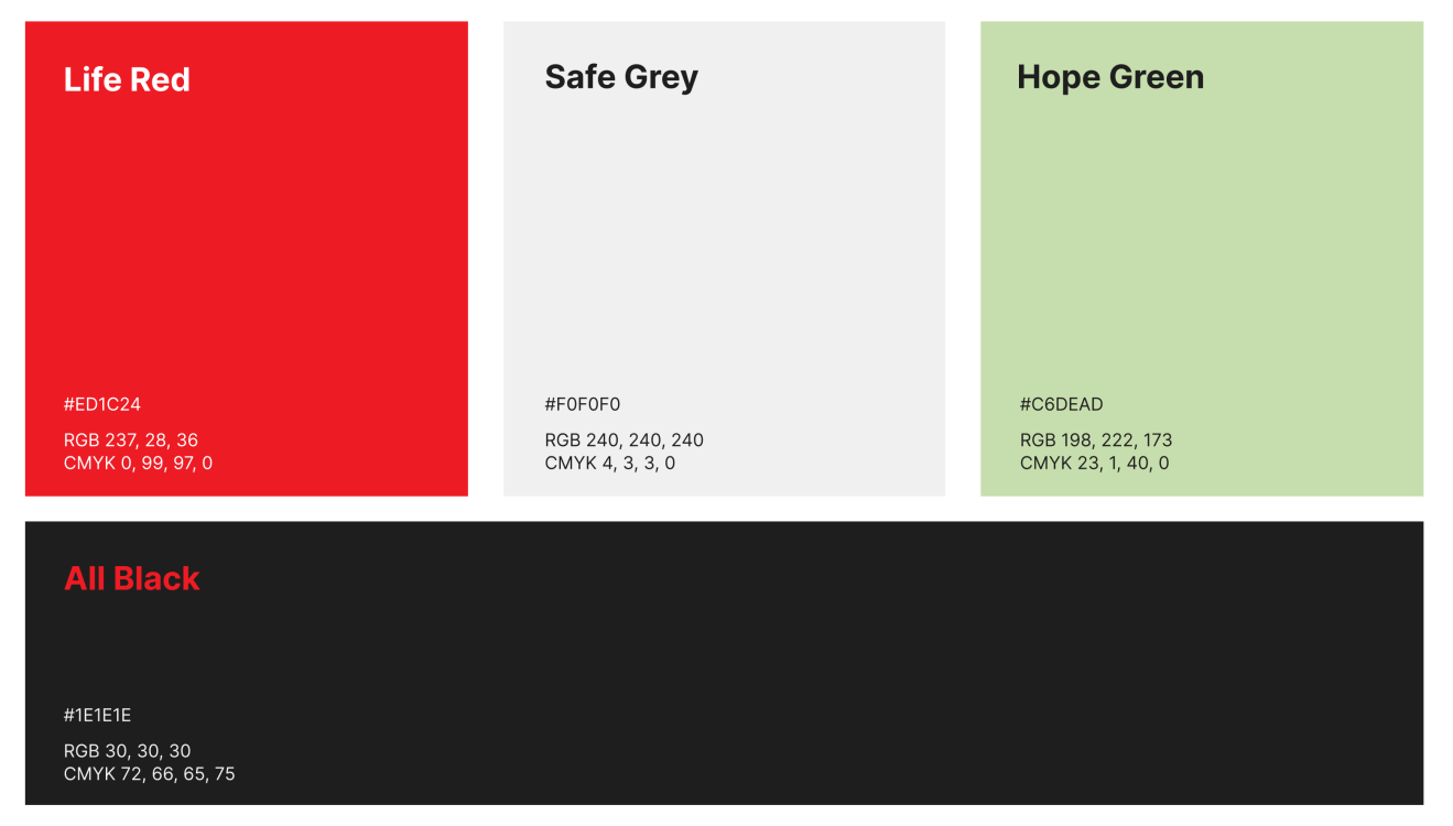
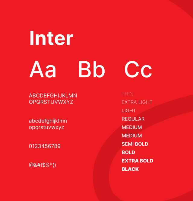
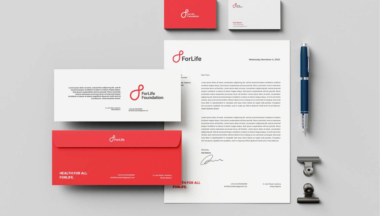
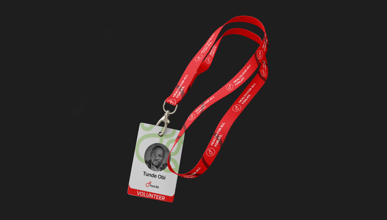
The catchphrase became the soul of the identity. For life is not decoration — it is a design principle. It informed every decision: the warmth in the color palette, the openness of the typography, the steadiness of the visual system across every touchpoint. An identity built to feel like a promise kept, not just a promise made.
The website carried this further. Every section from the flagship programs to the donation flow was designed to move people from awareness to belief to action. The experience needed to feel as reliable as the work itself. Clear, human, and built to last.
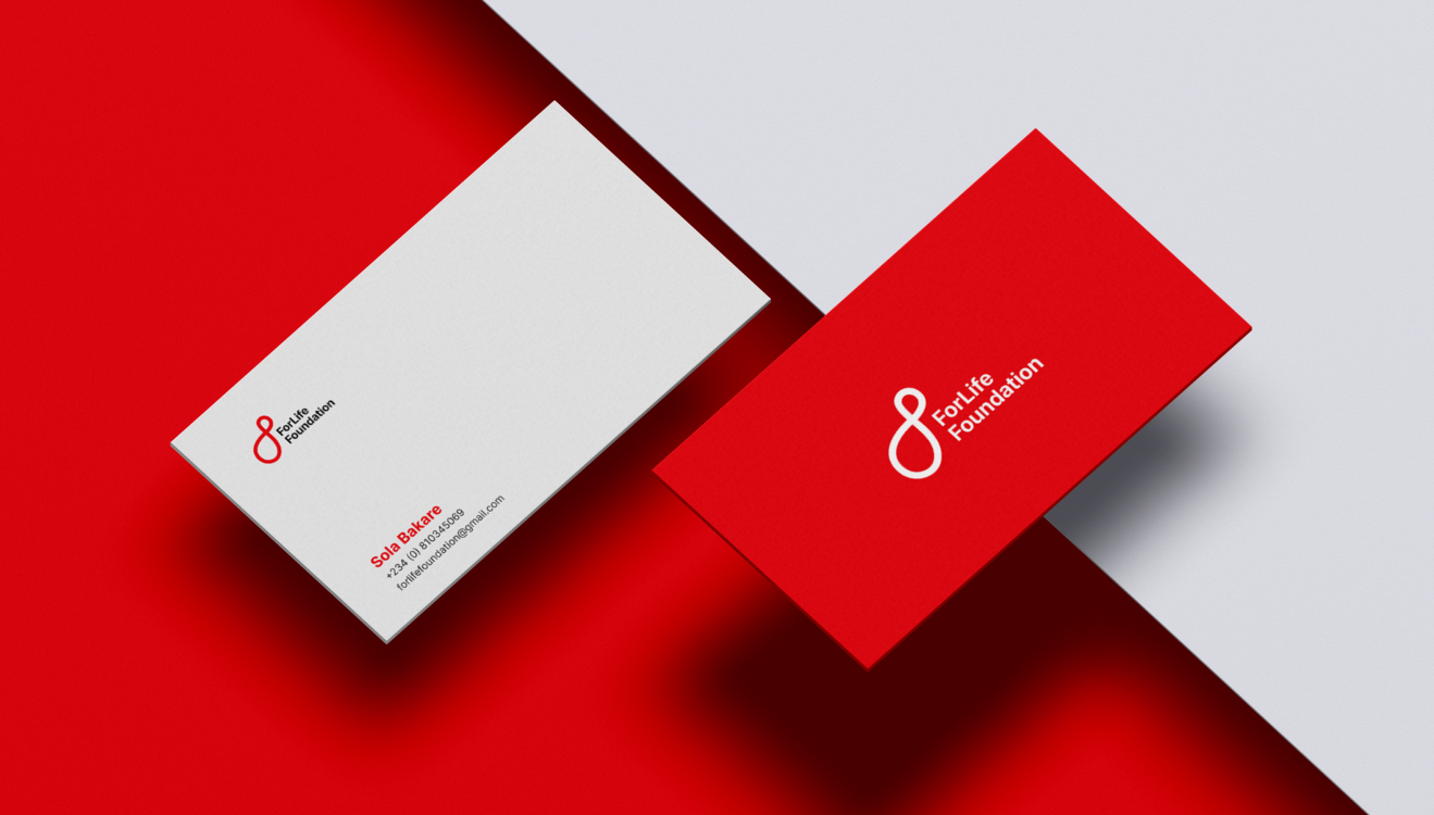
The new identity and digital presence embody For Life's commitment to helping families not just survive, but thrive today and always. For life.
Project Type
Brand Identity, Motion, Iconography, Merchandising
Date
October